-
Art Basel, known for its prestigious art fairs in Basel, Paris, Miami, and Hong Kong, connects artists, galleries, collectors, and a public to a diverse range of artworks, shaping the contemporary art scene. During the pandemic, Art Basel underwent a complex transition to React and Figma, lacking a unified source of truth. The project aimed to enhance the web experience, introducing new breakpoints and OVR rooms while accommodating changing show formats, all amidst tight schedules.
-
As Senior UI Designer, I led design efforts throughout the project, working both before and after the Lead Designer joined. My tasks included UX/UI design, prototyping, interaction design, and creating high-fidelity wireframes. I also identified components needing updates for responsiveness.
I managed development handoffs, ensuring a seamless transition from design to development. After demos, I conducted design quality checks.
I played a crucial role in client interactions, aligning our designs with their vision. I collaborated with a US-based colleague on the design system, streamlining the development handoff process.
-
Product Team: This team included the Product Owner representing the client and a Project Manager who also served as a Scrum Master.
Design Team: Initially, we had two UX designers. Three months into the project, a Lead Designer joined, allowing us to strengthen our design team processes and effectively build the design system.
Front-end Team: Comprising five members, the front-end team was responsible for developing both web and mobile versions of the platform.
QA Team: A three-person Quality Assurance (QA) team focused on ensuring the platform's reliability and quality.
Technical Architecture: We had a dedicated technical architecture team providing valuable insights into backend specifications, aiding in aligning our design work with the project's technical requirements.
ArtBasel Web
My Achievements
The redesign significantly improved the user experience, UI implementation, and user engagement for Art Basel's online shows during and after the pandemic. We successfully introduced a new yearly show in Paris. The client expressed great satisfaction and appreciated my contribution. Users praised the refreshed design across various pages, including OVR, Galleries, and Artwork. I played a pivotal role in implementing a new design system from scratch, ensuring consistency and efficiency in our processes. DMI hired three professionals (two in London and one in Barcelona) to support this system, reducing the time spent on design quality assurance. These improvements allowed us to allocate resources more efficiently and prioritize design innovation.
+25%
Enhanced Sales Growth
The average growth rate in sales in 2021 compared to previous years, with digital sales reaching an all-time high of $12.4B.
+30%
Increased User Engagement
Rise in participation across physical and digital realms, showing heightened interaction with the ArtBasel platform.
40%
Efficient Event Execution
Reduction in entry wait times due to QR code ticket implementation, improving event efficiency.
50%
Decreased Paper Waste
Reduced paper waste from traditional ticketing, significantly enhancing the attendee experience.

OVRs
Enhanced OVRs
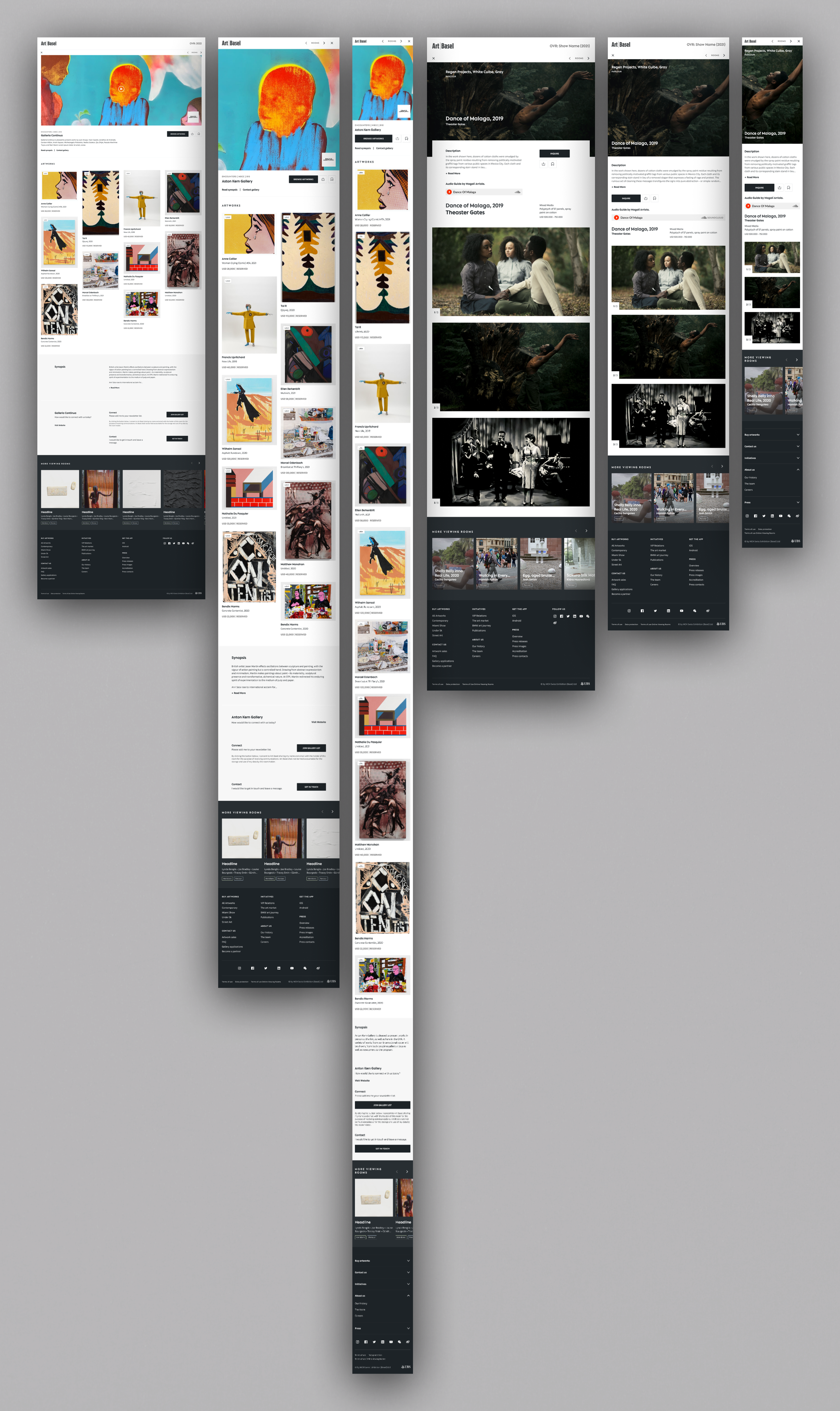
We introduced brand new breakpoints based on user device preferences, extending support to previously underserved Tablet and XXL screens, and aligning the experience with our users' diverse needs. Initially, we had three types of OVRs: Special, Hybrid, and Stand-Alone Rooms. However, due to a business decision, the Stand-Alone variant was deprecated. This change was implemented because there was considerable confusion between the Hybrid and Stand-Alone rooms, as they had practically identical designs, with only the show organizers possessing the necessary information to differentiate them.

Artists & Galleries

Global Navigation & Redesign of Cards
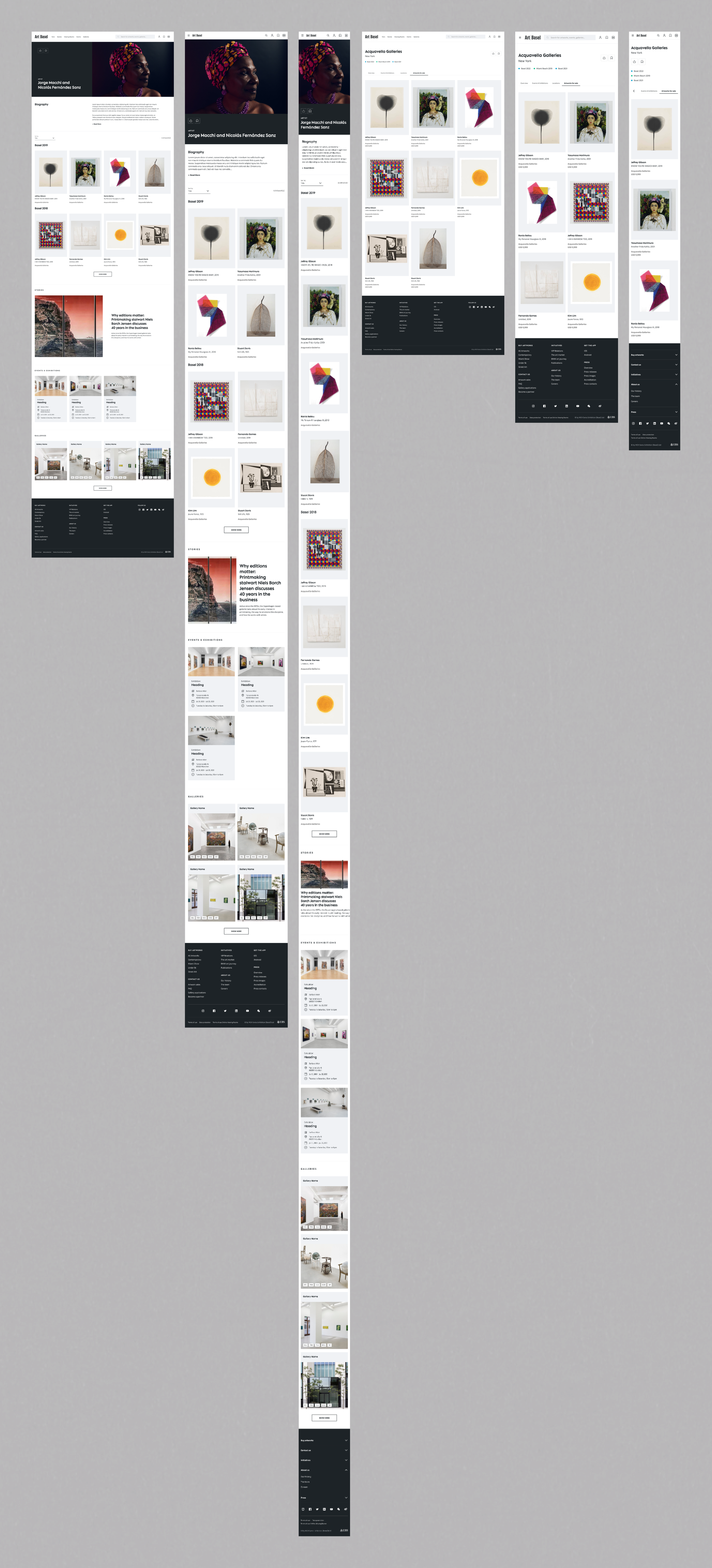
The transformation significantly improved Galleries pages with a constant presence on the platform. Streamlined global navigation made exploring extensive gallery collections easier. Redesigned cards enhanced user decision-making, and re-designed components boosted usability and engagement.
We proposed the 'Artworks for Sale' tab, aiming to help galleries promote off-show artworks and combat web traffic lulls between events. However, its implementation was postponed due to business decisions and changes within the Art Basel team.
Artist Pages were introduced to empower users to explore artists alongside shows and galleries. The updated global navigation facilitated seamless transitions from galleries to artists. Redesigned cards and components extended to Artist Pages, offering an engaging and informative experience.
In summary, these improvements significantly enhanced Galleries pages while introducing dedicated Artist Pages to enrich the art exploration experience.

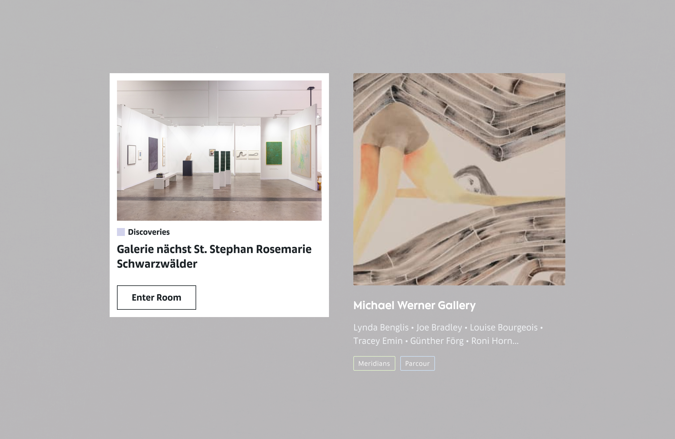
Hybrid & Special Rooms cards (old vs new)

As we worked on redesigning various card types such as Artworks, Special Rooms, and Hybrid Rooms (Main), they all had a place on the OVR page as tabs. The OVR page itself was highly customized to cater to multiple use cases, including non-logged users, logged-in users, and VIPs with early access. In this discussion, we're focusing on the redesign aspects.
Our task was to meet numerous requirements, including the creation of a comprehensive table with states and variants for these cards. The core changes we applied in this redesign included incorporating the new brand typography and creating new text styles, which were integrated into the new brand Design System (DS). We reimagined the interaction of these cards and introduced a redesign of the tags, where each of the 18 sectors had its unique color. We established rules for accommodating long room and gallery names and carefully devised aspect ratios for each card type. Additionally, we ensured that these cards would scale gracefully across our five breakpoints. Thorough testing was conducted to validate the functionality and appearance of these cards in a multitude of use cases.

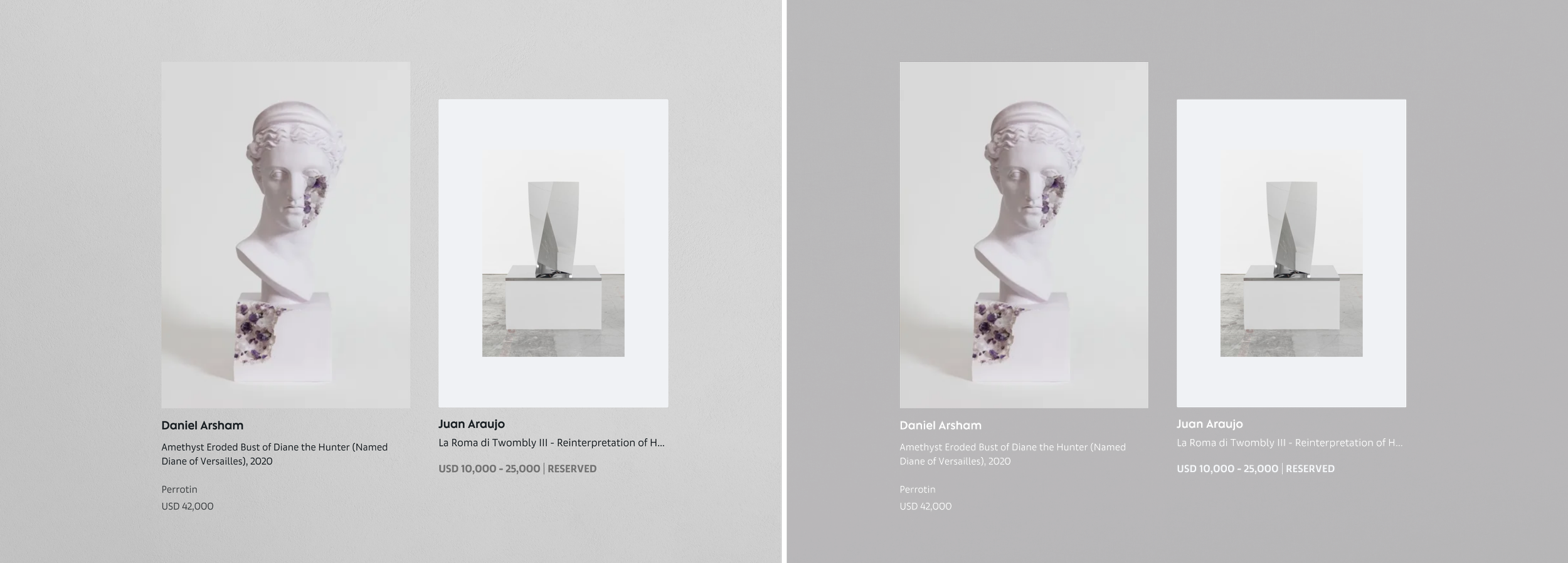
Artworks’ cards (old vs new)
In the example above, you can see that we introduced two themes for cards, but in the example of the Artwork cards. They were designed to be displayed both in the field and on the carousel, where the background is dark.
For the Artwork cards, we encountered additional requirements. Galleries in their OVRs had three options for how these cards could be listed: the Contained Layout, the Square Layout, and the Masonry Layout. To maintain consistency, we established that in the carousel, the card should appear as the Contained variant. As a result, only this variant featured both the light and dark themes to ensure visual coherence.

Events’ cards (old vs new)
As for the event cards, they presented a unique challenge due to the substantial content they contained. To streamline the design, we introduced a unified background, ensuring a consistent and clean presentation of information. Event cards had versatile use cases, as they could appear not only in listings or carousels but also within Stories, Galleries, or Artists pages.
To cater to different contexts, we introduced additional Medium (M) and Large (L) sizes, creating a horizontal orientation for these cards. Additionally, we incorporated a Call-to-Action (CTA) button, facilitating actions such as making appointments or purchases directly from the card without the need to navigate to the event page.

Old vs New
Hybrid Room (old vs new)
We made significant improvements to the UI that extend beyond mere aesthetics. Our primary focus was on content architecture, involving a meticulous reconsideration of the placement of various sections, descriptions, and additional information. This effort also encompassed ensuring the alignment of text styles, blocks, icons, and image aspect ratios.
Additionally, our work involved extensive testing across different breakpoints and various devices, with the primary goal of preserving the integrity of essential information in sections like the Hero, Synopsys, Recommendations, and others. These changes resulted in a lighter, airier, and sleek appearance, accompanied by smooth interactions, and improved the clarity of information blocks, contributing to a more seamless and responsive user experience.

Special Room (old vs new)
